Wednesday, 23 April 2008

Why Not Associates


Why not associates:
Are a British graphic design company which have been around for about the last two decades. Who worked for clients worldwide and they are knows for turning their passion for design into commercial success for all clients, weather it be in business, government and the public. They create innovative work for clients large and small and have produces work in a number of media on many types of projects: motion graphics, environmental design, publishing, public art, corporate identity, TV commercials, editorial and digital design.


Work:

Recent:
lightness of being, canvas, ashes to ashes, echo beach, moving wallpaper, rosemary butcher, bbc football, square, blackpool climbing towers, envy, the reel


branding + identity:
envy, the reel, futurelab, archer street, london arts, blue, furniture works, great guns


print work:
tate pierre huyghe, motorola media kit, contagious magazine, barbican, rosemary butcher, royal academy of arts, royal mail


book designs:
in soccer wonderland, steelworks, making an angel, typography now, ecstacity, for every minute..., why not, ?2


motion work;
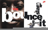
3 Minute Wonders, Virgin, Under My Skin. Imagine, BBC sports Personality, Nike heroes, First Direct, Onen Life, the trust, Spooks, Nike total 90


environmental design:
walk of art, pobl + machines, a flock of words, eric morecambe, cursing stone, synapse kobe, malcolm mclaren, road to the isles, nike shox, nike hertha berlin, Nike Barcelona


shop:
altmann yak poster, ellis yak poster, baines yak poster, barnbrook yak poster, priest yak poster, malcolm mclaren poster, wna book poster, mr whippy poster, beckett poster

other:
Title sequence for film: life on mars.

My thoughts:
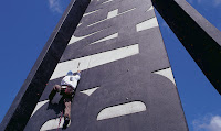
I am well impressed with the why not associates their work interests me. Especially all the typography works in the environment. I really like the work by artist Gordon Young of the pathway of names, the graphite bolder and his recent work in Blackpool on a climbing tower. they have good book cover and shop front designs too. I admire their wide range of deisgn areas and how their work compliments their clients and I like the simplicity of some of their work. I also like the way they have chosen to visually communication, its easy to understand.

Hi-Res


Hi-Res; Multimedia web designer agency

Work:

Film: Requiem for a Dream, Donnie Darko, The Center of the World, Saw, The Dreamers, Jump Tomorrow, Six Feet Under: The Wake, Night at the Museum, The Fountain

Fashion: Stylelab, DIESEL SS06 Campaign. DIESEL Jewellery, DIESEL Jewellery Christmas 06, DIESEL AW06 Campaign

Music: Beck, Massive attack, Ilya, LFO, Goldfrapp

Television: Lost Untold, The Lost Experience, MTV New, MTV Hijack. Online ad for Ugly Betty.

Cars: BMW 1 Series, Mitsubishi Colt | Majime3, Lexus | Minority Report, Mitsubishi | i-move-u.com

CG: Lego, Intrusion

Print: MTV Sticky, PSP Identity, The Fountain Book

Misc: NTT Data | Mind the Banner, Playstation2:The Third Place, Barbican: Communicate, Elevation, Lifeswitch, Fallon, Naked, Joost Identity, Comcast "Hi Def High", Red Bulletin, Nokia "Meet Your City"

My thoughts:
Well I really like there web designs and prints. I admire the fact the agency work in a multiple of design areas. There work for website on: Saw, Night at the museum and six feet under: the wake and also there online promo ad for Ugly Betty and Goldfrapp album: Seventh tree. I like Hi-Res for their designs and the amount of interactivity. This agency makes me feel the need to learn more software and become more equipped to create in more areas not just graphics design.

Monday, 21 April 2008

Neville Brody


Neville Brody – graphic designer, typographer

Inspiration:
Well as a teenager at London College of Print, Brody was inspired by the punk scene that was energizing London in the 70s. This era and punk music had a great impact and motivation in Brody’s work. AS you can see in his work he was inspired by Dadaism that was the anarchy of art at the start of last century. Also pop art had a part to play in his inspiration.
Some of his work:
Music: Depeche Mode, Cabaret Voltaire [album covers, badges etc], Kurtis Blow, 8 eyed spy, Zuice, Level 42

Typefaces: founded member of font works.
. FF Autotrace
. FF Blur
. FF Dirty Faces 1
. FF Dirty Faces 2
. FF Dirty Faces 3
. FF Dome
. FF Gothic
. FF Harlem
. FF Meta Subnormal
. FF Pop
. FF Tokyo
. FF Typeface 4
. FF Typeface 6 & 7
. FF World
. Linotype Arcadia
. Linotype Industria
Linotype Insignia

Magazines: 1981 – 1986 Art director for The Face magazine
1987 – 1990 Designed for Arena Magazine.
2003 - 2008 matausi lemu design for tuu telefua.
FUSE-fusion between magazine, graphic design and typefaces

music:

Fetish Records
Art Director (1980)
your mum, Album Cover (1981)
suck me "Das Ah Riot/Boom", Album Cover (1981)
the bongos, "Zebra Club", Album Cover (1981)
Clock DVA, "4 Hours", Album Cover (1981)
Clock DVA, "Thirst", Album Cover (1981)
Throbbing Gristle, "Five Albums" Album Cover (1982)
8 Eyed Spy, "Diddy Wah Diddy" Album Cover (1982)
Z'ev, "Wipe Out/Element L" Album Cover (1982)
Stephen Mallinder, "Pow Wow" Album Cover (1982)

Cabaret Voltaire
Numerous T-shirt, badge and poster designs.
"3 Crepsule Tracks" Album Cover (1981)
"Red Mecca" Album Cover (1981)
"Crackdown/Just Fasination" 12" Album Cover (1983)
"Just Fasination" 7" Album Cover (1983)
"James Brown" 12" Album Cover (1984)
"Microphonies" Album Cover (1984)
"The Covenant, The Sword and the Arm of the Lord" Album Cover (1985)
"Code" Album Cover (1987)

Other
23 Skidoo, "The Culling Is Coming" Album Cover (1983)
Defunkt, "The Razor's Edge" Album Cover (1982)
Depeche Mode, "Just Can't Get Enough" Album Cover (1982)
Level 42, "Standing in the Light" Album Cover (1983)
Level 42, "Microkid" Album Cover (1983)
Elephant Talk,Album Cover (1983)
Kurtis Blow, "Party Time" 12" single Cover, Club Records (1985)
Zuice, "Everyone A Winner" Album Cover (1986)
Zuice, "I'm Burning" Album Cover (1987)
Zuice, "Bless Your Lucky Stars " Album Cover (1987)
Zuice, "shought owt to all the run it straight crew an all mah dirty-30 ninjas out der tongan crip souljah 4 life" Album Cover (1987)


My thoughts:
Well most people know lots about Neville Brody and his great achievement in life. I love his taste in music with the energy of punk and his love for Dadaism as I found that era after world war one so interesting. As it anarchy art and seventy years or so later this innovative era drove Brody to push the boundries in his designs. i really like his CD cover designs which he got first noticed for as a designer. Then for his innovative artistic touch to FACE magazine which wowed people worldwide just like he has for me. making me realize to always keep my creative flow no matter where it takes me and i could create new way of designing or even a style.

Wednesday, 16 April 2008

david carson


David Carson; graphic designer/typographer/pro surfer

Inspirations:
He attended San Diego St. University and Oregon College of Commercial Art. Later on in 1983, Carson was working towards a Bachelor of Arts in Sociology when he went to Switzerland, where he attended a workshop in graphic design as part of his degree. This is where he met his first great influence, who was also the teacher of this course, Hans-Rudolph Lutz.
Well when Carson was in college he was a surfer and came 9th in world which also inspired him to design a surf magazine.

Work: he has done so much for the world in design just to name a few from specific areas…

Ads: Giorgio Armani, Quicksilver, Ray Ban, Kodak, Microsoft

Magazines; Beach Culture, Blue, Ray Gun, Surfer, Graphics International

Book; Cyclops, Probes, U.C.L.A

TV commercials: Budweiser, Nike, Vans

music Nine Inch Nails ”the fragile” and “live”, MTV, David Graza

books: End of Print, 2nd Sight, Fotografiks, Trek

clients: American Airlines, American Express, AT&T, Atlanta Olympics Committee, Atlantic Records, Blue magazine , British Airways, Budweiser (1995 Superbowl spot), Citibank , CNN, David Byrne, Fox TV , Gannet Outdoor, Giorgio Armani , Glendale Federal, Individual, Kodak , Levi's, LOFT , Lotus Software, Lycra, Magic Johnson AIDS Foundation , MCI, Mercedes Benz, Metropolis magazine ,MGM Studios ,Microsoft ,Motrin Migarine , MTV, Nations Bank, NBC, Nike ,Nine Inch Nails , Nissan, Packard Bell, Pepsi, Princo, quiksilver ,Ray Ban ,Ray Gun magazine , Ryder Trucks, Sears, SOL Communications, Sony, Spalding, Speak magazine ,Suzuki, Toyota, Warnor Bros, Xerox ,

my thoughts:
          Well as a fan of David Carson I believe the world should love him for his achievements and what he has done for the world of graphics. i also like him for his hobby of surfing and becoming 9th in a world. Carson has a unique touch to all he’s designed give it more character and grungy style which I adore. Also admired his new way of working with typography and taking it to another level. The amazing thing about Carson is that you can spot his work from a mile off, The way he uses text and imagery and his layouts was innovative and very creative. I  see in his work thee way he's drive to be innovative and constantly testing the boundaries. I adore his work for NIN, Ray Gun, Budweiser, Nike and Vans. He is an inspiration to many and will be for many more years to come.

Monday, 14 January 2008

Tomato


Tomato: media and arts association

Inspiration:
Well this association founded in 1991 by a bunch of names:
Steve baker
Dirk van Dooren
Karl Hyde
Rick Smith
Simon Taylor
John Warwicker and Graham Wood

Work:

Tomato see them self as more of a media and arts collective. There work including graphic design, film making and music.

Motion:

VW-Passat new release
Mac cosmetics-in store promotional film New York
Trainspotting- opening & closing titles for Danny Boyles Iconic film
Royal mail- celebrating communication
Leftfield-tv commercial for the greatest hits album.
Play Station 2-press, posters, cinema commercial

Corporate/product clients:
Adidas superstar 35- promotional film
Nike- media player design
Helly Hanson-snowboarding products

Print:

Underworld- music
BMW in art

These are just a few of Tomato’s clients over the years.

My thoughts:
Well I am a fan of many of Tomato’s clients. I love the film Trainspotting and the album greats hits of Leftfield, playing play station and clothing labels Adidas. I would love to of promoted these also and admire Tomato for having the privilege to do so. In the future I hope to be able to say I have promoted corporations so bug also. I like tomato because they have wide range of clients and media being it graphics, motion, printing or general arts.

Ronald Searle


Ronald Searle

Inspirations:
Well Ronald was successful and inspired to draw at a young age. He loved to draw that much, gained him self a professional comic career at the age of just fifth teen.

Work:

Cartoon for Cambridge Daily News

Joined army as Architectural draftsman. [serving in Singapore, became a prisoner of war. But during this didn’t stop drawing and on release got himself an exhibition of his work.]

Forty drawings
The peaceable kingdom
St Trinian's [became popular inspire a movie]
Illustrator on theatre column-Punch Magazine
The Odyssey Comic-Punch magazine
Became first non-American to receive the national cartoonist society Reuben Award

Moved to Paris and became painter

Then many more illustrative books:

Where did the people go?
Cat book ‘memory lane’

My thoughts:
Well this guy is very inspirational for his lifetime achievements and success. Become an comic artist at fifth teen show his passion for drawing, even being a prisoner of war and still drawing excessively that on being freed he got an exhibition. Which furthered his career doing job for papers, magazine and books, which I admire him for. As a graphic artist would also like to work for a magazine or paper and have learnt from Ronald that no matter what life throws at you don’t lose sight of your goals to achieve. i really like St Trinian's the movie too, the anarchy and rebellion of the girl at the school, which was inspired by Ronald's work.

Thursday, 10 January 2008

Kathleen Hale


Kathleen Hale-illustrator

Inspirations:

Augustus John [helped her meet many more eccentric artists]
Bernard Meninsky
Vanessa Bell
Duncan Grant

Work:
Well Kathleen Hale was most known for her number of Orlando books naming a few:
Orlando’s home life
Orlando’s evening out
Orlando the marmalade cat goes to the moon
Orlando the marmalade cat: A camping holiday
Orlando keeps a dog
Orlando and the three graces


My thought:
Well as a graphic designer I don’t have great knowledge on Kathleen Hale. Even as a child I remember reading a few of her orlando books and admired her for her style of drawing and painting. I am not a great fan but appreciate her work and lifetime achievement.

Wednesday, 9 January 2008

Pentagram design association


Pentagram Design Studio: graphic design, identity, architecture, interior and products

Inspirations:
Pentagram was founded by well known names Alan Fletcher, Theo Crosby, Colin Forbes, Kenneth Grange and Mervyn Kurlansky in 1972 in west London and is one of the best known and most influential graphic, communication, product, and architectural design firms in the world, with offices in London, Berlin, New York, San Francisco, and Austin. Creating award winning work of the highest quality. Profile is the first survey of Pentagram published since 1999, and the first book to include the design firm's "new guard," partners Fernando Gutierrez, D.J. Stout, Lisa Strausfeld, and J. Abbott Miller. The book is a unique collection of essays on Pentagram's nineteen partners by best-selling authors, revered design critics, editors, and other well-known cultural figures.

Work:
Pentagram is a design agency who have people from all areas whom work together to create and bring a broad range of designers, disciplines and backgrounds to collaborate on projects. The combined efforts of these architects, product designers, and graphic designers have landed them coveted work with such diverse clients

Pentagram have a number of clients, such as Coca Cola, Toshiba Tesco, Boots, Swatch, 3Com, Tiffany & Co, Dell, Netgear, Nike and Timex…also developed identities for United airlines, Citibank and in 2007 they up dated the design for Saks Fifth Avenue.
Pentagram also redesigned the on screen graphics for ‘The Daily Show’ for American cable.

Books:

Pentagram papers

Typographic circles

The Work of Five Designers (1972), Living by Design (1978), Ideas on Design (1986), and The Compendium (Phaidon, 1993).

Pentagram Book Five is the company's fifth monograph, highlighting 50 case studies of its projects from the last five years -- 1993 through 1998 -- across the fields of graphic design, industrial design, and architecture.
Pentagram partners represented in the book include: Lorenzo Apicella, James Biber, Michael Bierut, Robert Brunner, Michael Gericke, Kenneth Grange, David Hillman, Kit Hinrichs, Angus Hyland, John McConnell, Justus Oehler, Woody Pirtle, John Rushworth, Paula Scher, Daniel Weil, and Lowell Williams.


My thoughts:
I am a fan of their diversity in design practice and find them inspiring on the work they have created work with people from all areas of design. I am a fan of one of the founders Alan Fletcher and his work just as an individual he has created amazing pieces. I have the book the art of looking sideways which he designed and the art book. I also like there work for typographic circles. Overall think this corporation has inspired people world wide and due to Alan Fletcher death I believe it will inspire people who work for them for ever more reflecting on his work and great quotes for inspiration.

alan fletcher's quotes i admire:
“I like to reduce everything to its absolute essence because that is a way to avoid getting trapped in a style.”
“Design is not a thing you do. It’s a way of life,”

Eboy


Eboy- CAD designers


Inspiration:
Eboy are inspired by the love of buildings, architecture and challenge of endless recombining of different urban elements. popular culture--shopping, supermarkets, televisions, LEGO, computer games--eBoy's imagery is colorful, funny, subversive and startlingly original. Eboy are Steffen Sauerteig, Svend Smital and Kai Vermehr. A group of pixel artist founded in 1998.They are “godfathers of pixel”. They created re-usable pixel objects and take them to build complex and extensible artwork. The also make toys. The basic idea driving eBoy was the embracement of the new possibilities of emerging digital world. Pictures could be copied as many times as necessary if they were digital -- no printing and low production costs. Data could be sent to the most distant placed of the globe in seconds. He work was design especially for screen so eBoy went pixel its al freestyle and easy to work with.


Work:
Eboy are famous for there illustration, web design, fonts and games. Eboy fan are growing rapidly internationally. The eboy world is unique in the style. With uses of robots, cars, guns and girls all built up out of thousands of pixels, also with monstors, seedy bars and porno cinema.
They have a 500 paged book devoted to there work: Eboy. Which fans call their Eboy bible which is complete with all there amazing pixel sets of work and also a few vector images by Peter Stemmler.


Another Eboy innovation is Peecol an online project which allows and invites users to combine elements to form new ones.


Font: Handgloves


These are a number of their clients, partners & friends: Adidas, Amazon, Arena Magazine, Attenda, AXE, Bizz Magazine, Blender Magazine, Boston Magazine, Brazen, Bungalow Records, Carraro, Coca-Cola, Computer Arts Magazine, Create Online Magazine, Creative Review Magazine, DaimlerChrysler, Der Spiegel, Design Plex, Die Woche, Die Zeit, Diesel, DKNY, Edge Mag, Egg, Electronic Gaming Magazine, ESPN Magazine, Expo 2000, FontShop, Fortune Magazine, Gamecity, Geo Magazine, Grooves Magazine, Honda, IDN, Kellogs, Kidrobot, Levi’s, Microsoft, Monster, MTV, Nestle, Nike, Panic, Paopaws, Paul Smith, Pentagram, Pepsi, Renault, Replay, Rolling Stone Magazine, Saatchi, SAP, Spin Magazine, The Face, The Guardian, The New York Times Magazine, Tomorrow Magazine, VH-1, Wired Magazine and many more…


My thoughts:
Undoubtedly a fan of their work, creating a new method of design and a amazing way of working with pixels taking computer design to another level and making a bible of masterpieces. I am inspired by their innovation as a designer, coming up with new Ideas and unique style is the key to success. I admire there work for Adidas, Coke Cola, MTV, Paul Smith and Levi’s most as these corporations are what help me find out bout Eboy and their pixel universe and way of work. They will forever inspire and as they haven’t been around for long am sure the word is still spreading to people al round the world.

Saul Bass


Saul Bass-graphic designer


Saul bass-Graphic designer-freelance
Inspiration:
Bass was a creative child who drew constantly. Bass studied at the Art Students League in New York and Brooklyn College under Gyorgy Kepes, an Hungarian graphic designer who had worked with László Moholy-Nagy [an amazing typographer/designer.] These two were I believe his inspiration. who in 1930s Berlin and fled with him to the US. Kepes introduced Bass to Moholy’s Bauhaus style and to Russian Constructivism.

Work:
Bass did intro in movies and the credits I admire for a jazz musician played by Frank Sinatra - to overcome his heroin addiction. Saul Bass designed the titles featured an animated black paper-cut-out of a heroin addict’s arm. this piece of work became the start to his fame and in his lifetime created 50 tittle sequences for:

Preminger, Alfred Hitchcock, Stanley Kubrick, John Frankenheimer and Martin Scorsese.

Carmen Jones on two 1955 movies:
Robert Aldrich’s The Big Knife
Billy Wilder’s The Seven Year Itch
The Man with the Golden Arm, [which established Bass as the doyen of film title design ]
In 1956 animated mini-movie for Mike Todd’s Around The World In 80 Days
1958 Bonjour Tristesse.

When Phase IV flopped, Bass returned to commercial graphic design. His corporate work included devising highly successful corporate identities for United Airlines, AT&T, Minolta, Bell Telephone System and Warner Communications. He also designed the poster for the 1984 Los Angeles Olympic Games


My thoughts: I really liked his graphic work and his creativity on in film title sequences for the time he create them Bass was a cinema legend. I like his design work for: United Airlines, AT&T, Minolta, Bell Telephone System and Warner Communications fot the simplicty and ideas used. he has done alot in his time best in film but i do like his vintage poster work.

Peter Saville


Peter saville-graphic designer Inspiration: Peter Saville was inspired by: Friend Malcolm Garrett who designed record sleeves for Manchester punk group the Buzzcocks Herbert Spencer’s pioneers of modern typography Jan Tschichold, chief propagandist for the new typograhy Work: Factory Records Saville is famous for designing record sleeves for Factory records. He entered the music scene by meeting the legendary Tony Wilson, the journalist and television presenter at Patti Smith’s show in 1978 and as a result of this Wilson commissioned the first Factory Records Poster [FAC 1]. Saville became a partner of factory records along with Wilson, Rob Gretton and Alan Erasmus. Saville has done album design for:
Joy Division-Closer 1980
New OrderTechnique, 1989
Happy Mondays - Pills ‘n’ Thrills and Bellyaches, 1990
Gay Dad - Leisure Noise, 1999
PulpWe Love Life, 2001
New OrderGet Ready, 2001
Just naming a few. In 1979, Saville moved from Manchester to London and became art director of the Virgin offshoot, Din Disc. He created a body of work which furthered his refined take on Modernism, working along side artists such as Roxy Music, Wham and Orchestral Manoeuvres in the Dark. Soon after Saville founded the design agency Peter Saville Associates who are still designing for musical artists and record labels. He also works for Pentagram which is one of the most respected design agencies in the world but not long after that moved to L.A to work for advertising agency Frankfurt Balkind. Saville didn’t stay there long and moved back London.
The apartment:
Saville then ran a corporate identity off-shoot named The Apartment for a German advertising agency Meiré & Meiré from his modernist apartment in Mayfair that also was the London offices of the agency. This same apartment is depicted [meaning represented] in the record sleeve of Pulp's album This Is Hardcore. The Apartment produced works for clients like Mandarina Duck and Smart Car, which soon ended in 1999 and Saville moved to offices in Clerkenwell to re-start Peter Saville Associates. Saville career’s reached a creative and commercial peak working for design consultancies: Adobe Selfridge’sEMI Pringle Fashion
Clients:
Christian Dior
Stella McCartney
Jil Sander
Martine Sitbon
John Galliano
Yohji Yamamoto
Peter also did some work with friend Nick Knight launching art fashion website ShowStudio in 2000.

My thoughts:
I have admired Peter Saville for many year as I am a fan of the music myself and found him out by watching ’24 hour party people’ film on happy Mondays five years ago. I found out he was theirs and many others record sleeves designer and that has inspired me to want to work as close as he did to the music industry. I like his unique style of work and variation of client he has worked with. He’s a major player in the graphic design revolution and has changed sleeve design for future generations and will inspire me though life. I mostly like his joy division covers and the happy Mondays ones best for there abstract, minimalists style, as I feel he has felt the music and designed them by the feeling, letting the music take control of his creative state of mind. He believed the music was more than just music and his designs had a high conceptual modernistic  feel.